contact us
Client:
Year:
2015
Service Offered:
App design for their coming glass app.
The very first version of the Google logo was never going to win any design awards. Seemingly created using Microsoft Word, it’s a real reminder of just how ugly the early internet could be.

In its defense, this logo was only put in place while the search engine was still a research project carried out by Larry Page and Sergey Brin at Stanford University. Once the pair decided to launch Google officially, Brin whipped up a better design himself using the popular open-source image editing package GIMP.
As you can see, several elements of the now-familiar design are already in place. The color order is a little different, but that would be amended in a new version that was used from October 1998 onward.

This iteration uses the Baskerville Bold typeface, like its predecessor, but tweaks the 3D effect on the lettering, and adds an exclamation point — a response to Yahoo’s similar branding at that time, according to a report from Gizmodo.
While it’s long since been replaced as Google’s primary branding, this logo is actually still in use. If you travel back in time by searching for ‘Google in 1998,’ you’ll see it featured as part of a special throwback interface.
As Google grew in notoriety, the decision was made to upgrade its branding. Page and Brin decided to call upon the services of designer Ruth Kedar, who made her name creating widely lauded sets of playing cards, and by the late 1990s she was installed as a member of the art faculty at Stanford.
Kedar produced a number of different concepts for the new version of the logo. Many of them used imagery to express core components of the Google experience, like a target to evoke its precision, or a magnifying glass to make sure it was obvious that it was a search engine.
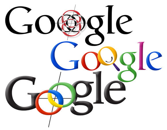
These designs show things falling into place. The basic color scheme is there, albeit with some minor edits. The top two examples even use Catull, the typeface that would be used in the logo for over a decade.
Of course, none of the logos above made the cut. The company decided that adding too much visual flair would ultimately turn out to be restrictive. “This is where we started simplifying,” Kedar explained in a 2008 interview with Wired. “The idea was, ‘Can we create the sense of playfulness without having recognizable or identifiable objects that are going to end up limiting us?'”
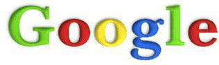
Above, you can see the design that was selected. It was in use from May 31, 1999, to May 5, 2010 — the company’s longest serving logo to this day. This was the branding that carried Google to the top of the search engine market, but the changing face of the internet eventually forced the company to change its long-standing look.
In the past decade, we’ve seen all kinds of companies replace detailed logos with newer iterations based around flat blocks of color. Google can count itself among that number, but its transition took place in two distinct stages.
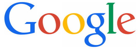
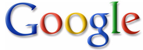
After changing to brighter colors and a more subdued shadow effect in 2010, Google made big changes to its branding in 2013. The 3D effect on the lettering was completely eliminated, and some minor typographic changes were made — note the tweak made to the way the straight line meets the curve on the ‘e’.
This iteration would turn out to be a relatively minor revision, however, compared to what was coming two years later; a brand new typeface.
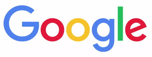
Google created this font, which is called Product Sans, in-house. It highlights the lack of shadow and the high contrast of colors in the logo, while also providing a more modern font appearance that doesn’t look like something that might be cranked out with a typewriter. This has become the Silicon Valley trend, used by everyone from Microsoft to Motorola.
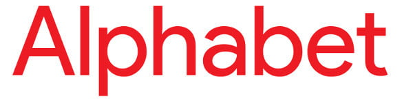
A slightly amended version is also used in the logo for its parent company, Alphabet.
The latest Google logo maintains the visual identity of its predecessor, but the new typeface makes it look more modern. Its accompanied by a version of the stylized ‘G’ character that’s used for app icons and the like.
What’s next for Google’s branding? Only time will tell. But if there’s one thing that we can learn from the changes made to its logo over the last twenty years, it’s that the company isn’t afraid to tweak things to keep up with the times.
...
As our client you’ll be introduced to your personal Project Manager who will take care of your project needs.
info@splext.com
+44 1869 248945
204 Bolander Grove, London, SW6 1EY
Join our mailing list for updates
Follow us in our social networks


.png)